Marché Main
Your neighbourhood grocer on Main Road
Challenge
Groceries should feel like a place you go, not a task you get through. But the neighbourhood grocer is under pressure. The big chains beat them on price, the delivery apps beat them on convenience, and little by little they get pushed off the street they've been part of for years.
Hudson is a bilingual town, and Main Road is where everything happens. This grocer already had the good stuff: the right spot, great produce, and customers who genuinely cared. What was missing was a brand with enough presence to actually stand out and hold its ground.
So the challenge was pretty clear, make shopping local feel like the obvious choice, not a favour you're doing someone.
What We Did :
Branding & Identity, Website Design & Development
Category
Retail / Food · 2026
Strategy
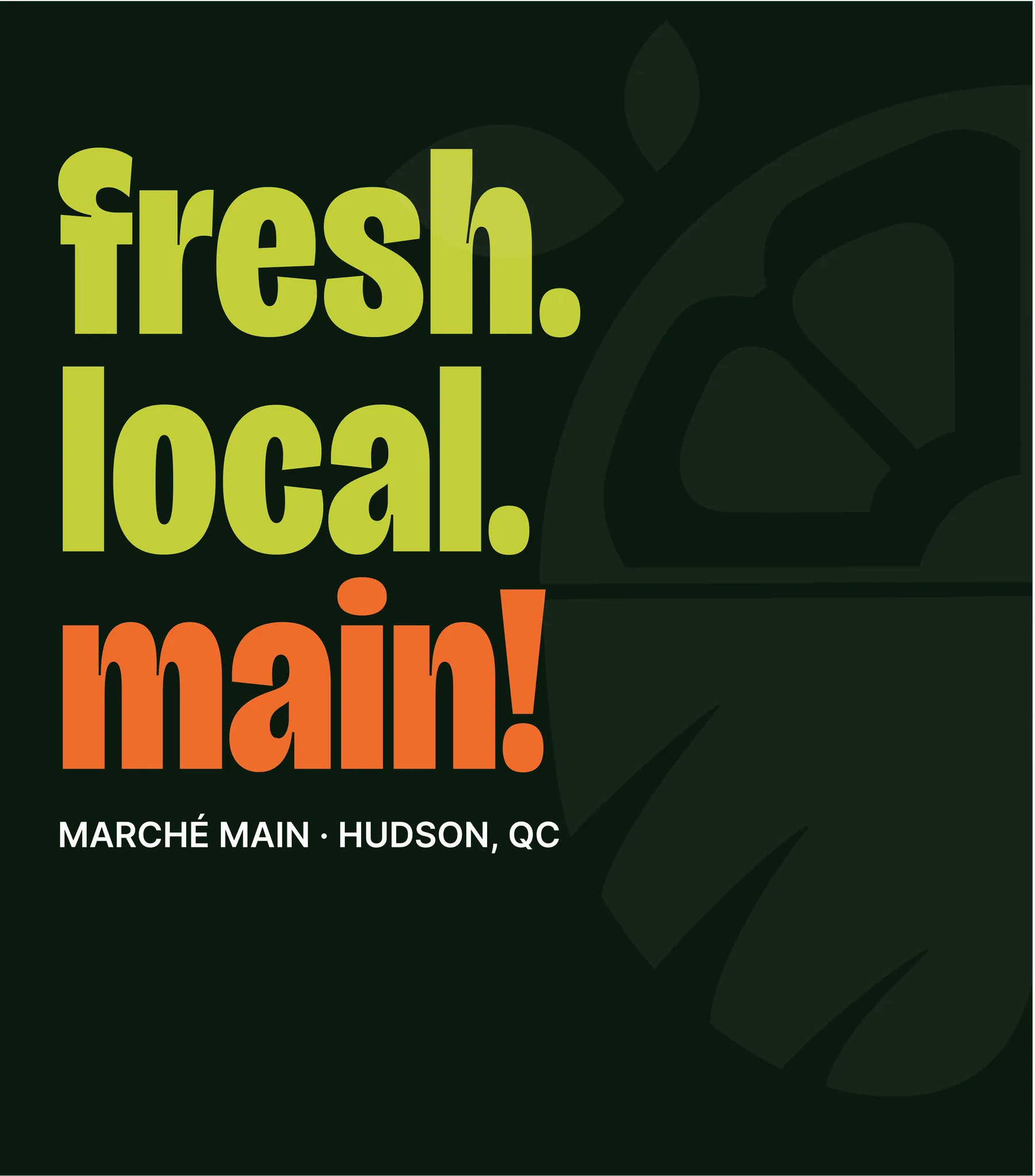
The strategy started with the name and never let go of it: main by name, main by nature. "Marché" is the market. "Main" is the street it sits on and the point. Marché Main isn't a store on Main Road; it's the main event of Main Road. The one you walk to, the one you talk about, the reason the street has a pulse.
That double meaning does double duty in a town that lives in two languages. French marché, English main; a brand that sounds like Hudson talks. For shoppers it means fresh, local, proud. For the street it means an anchor. One idea that turns a corner grocer into a landmark: we put the main in Main Road.
Identity
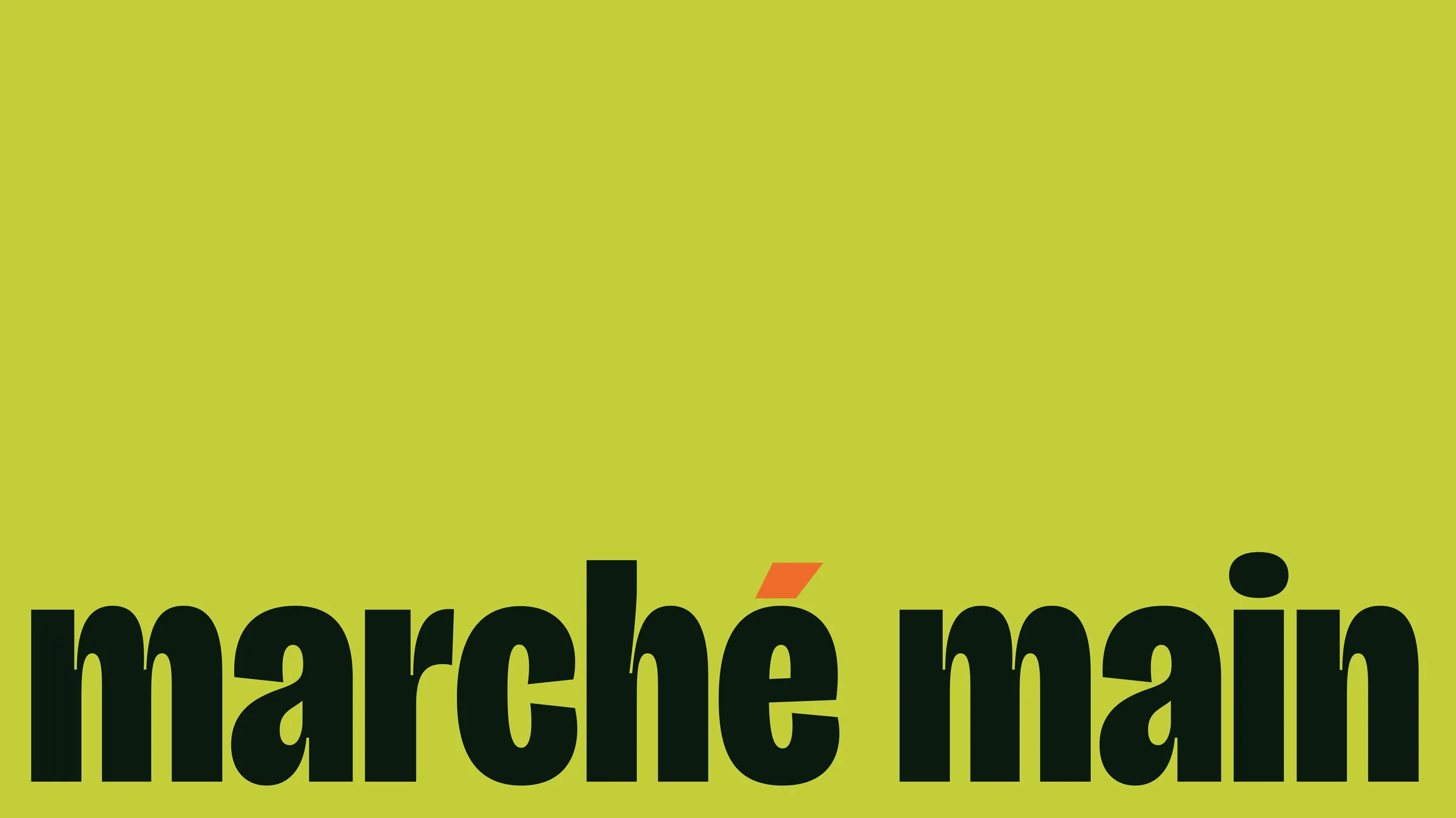
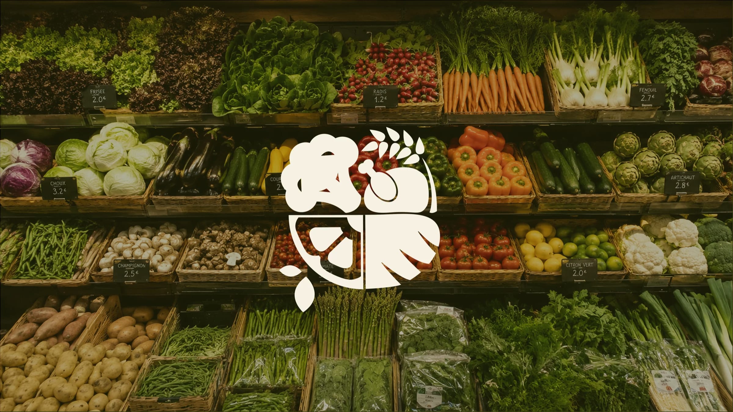
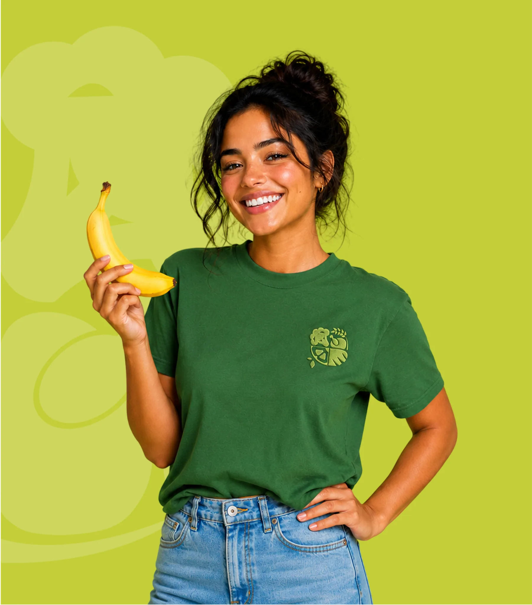
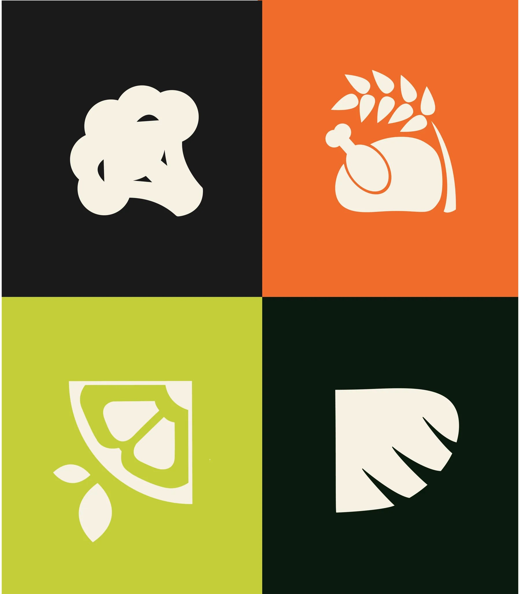
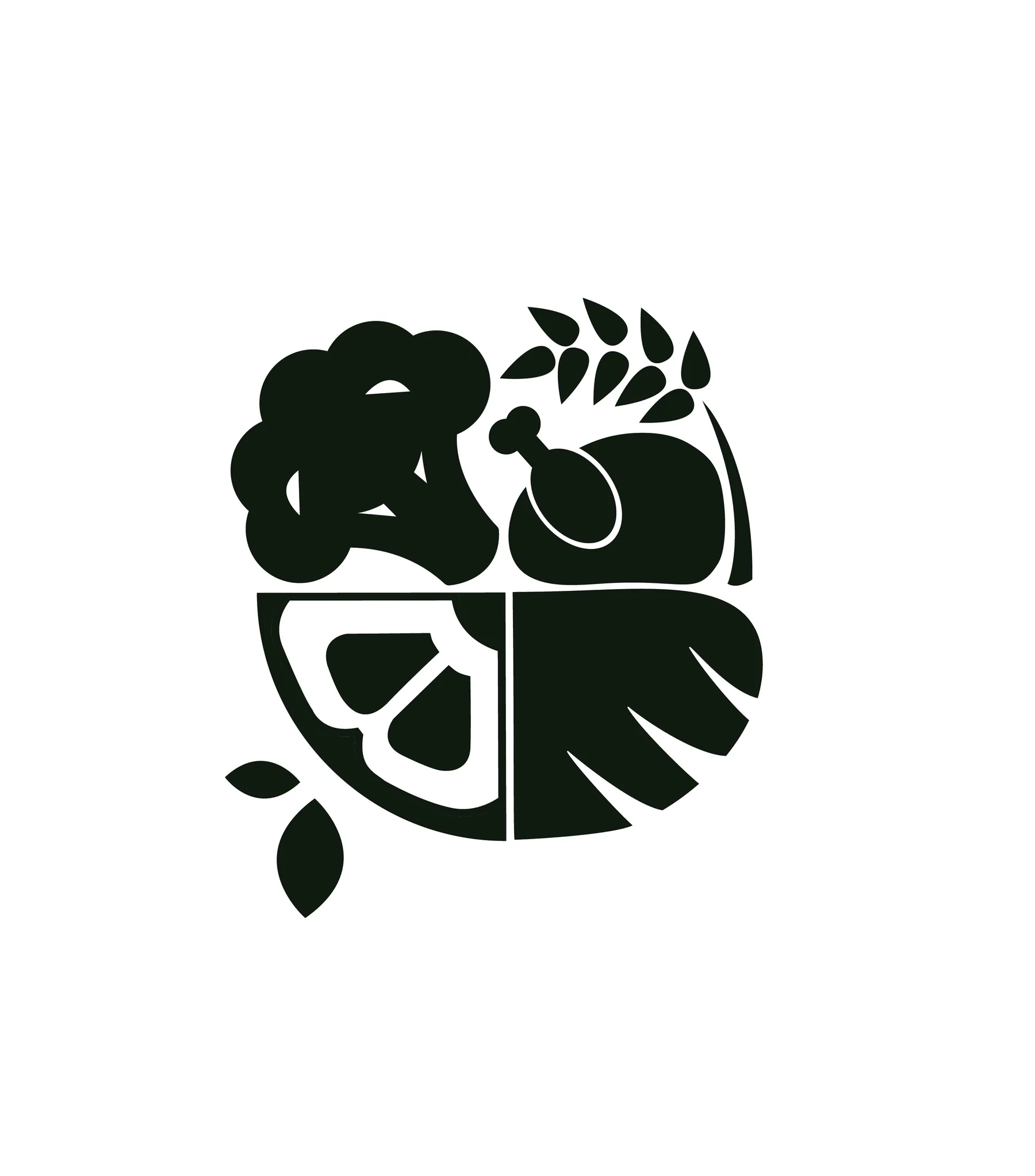
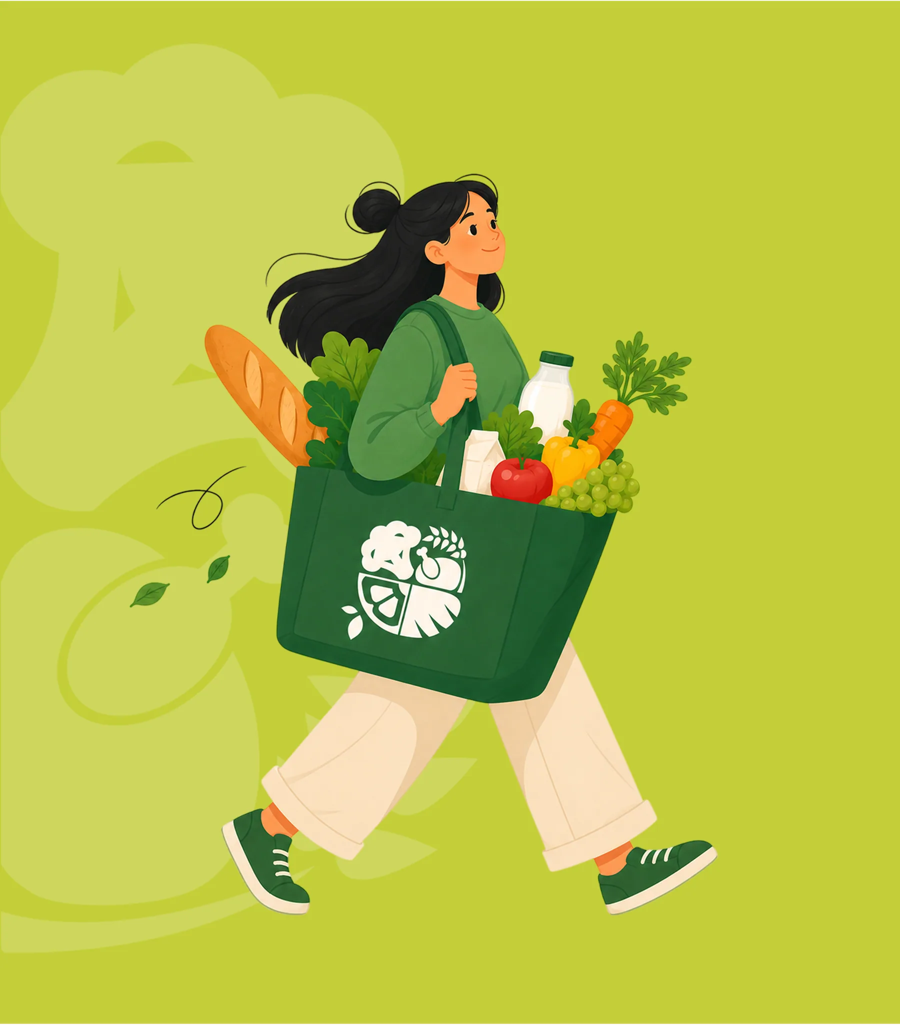
Marché Main is bold by name, bold by nature. A heavy, hand-cut slab wordmark carries the weight of a market awning, with the accented é sprouting a single leaf, fresh baked right into the logotype. A produce-face monogram gives the brand a character you can wave at across the aisle.
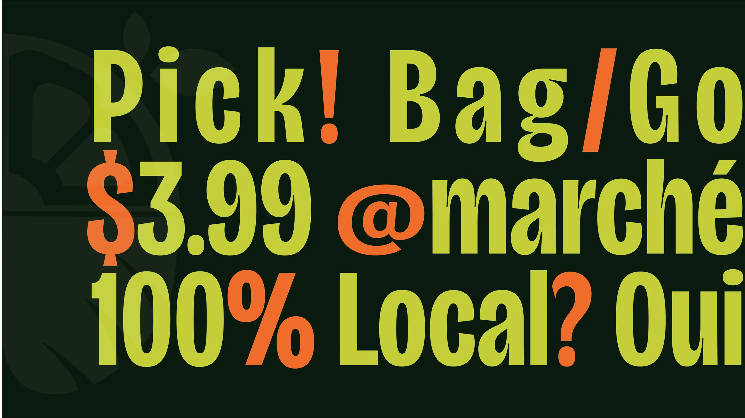
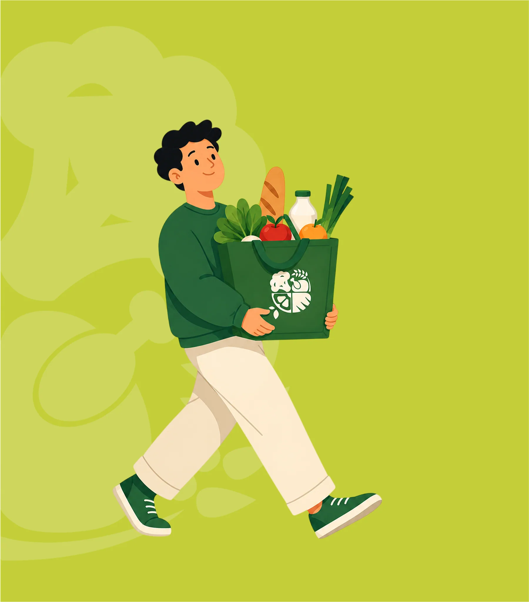
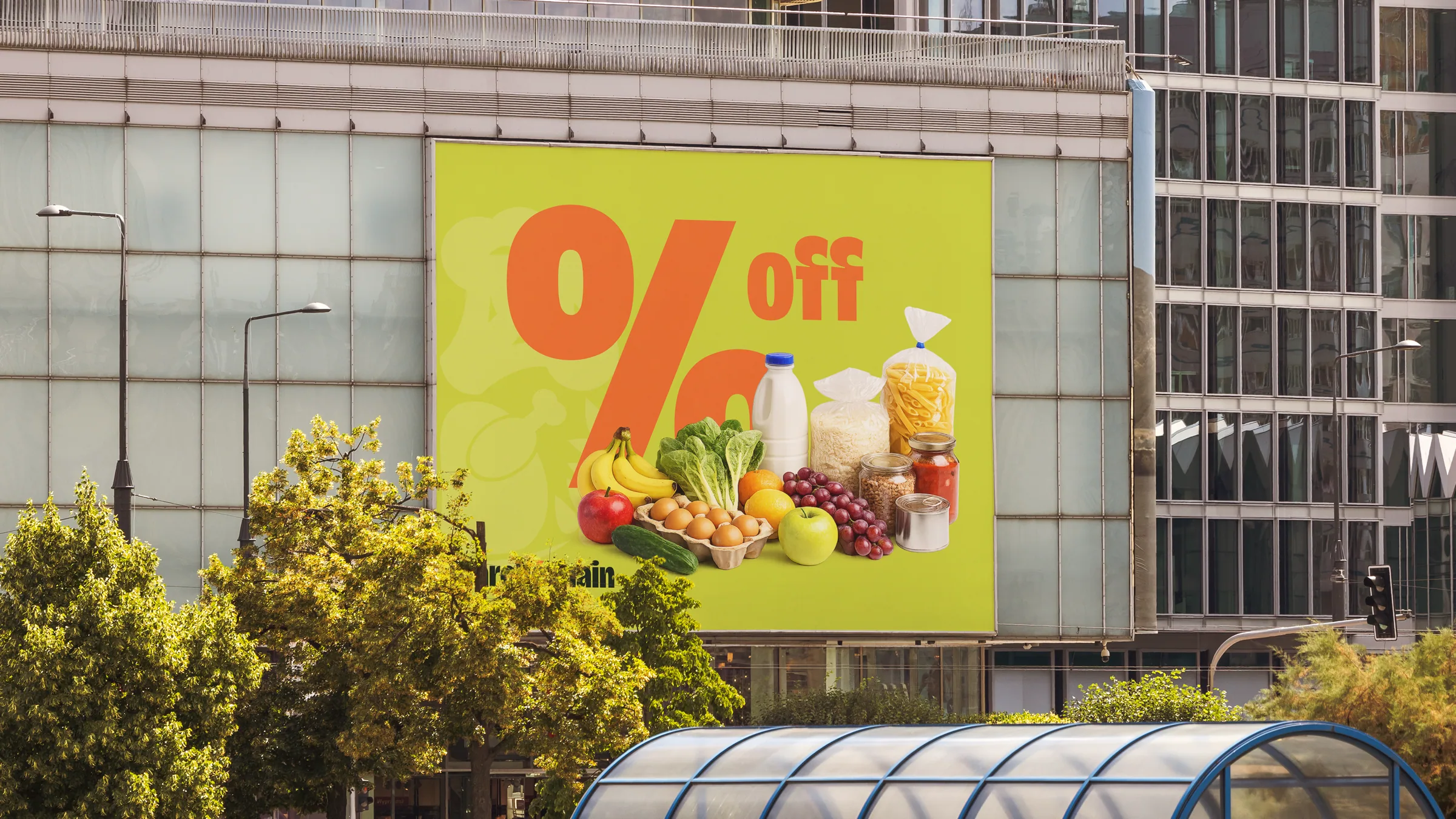
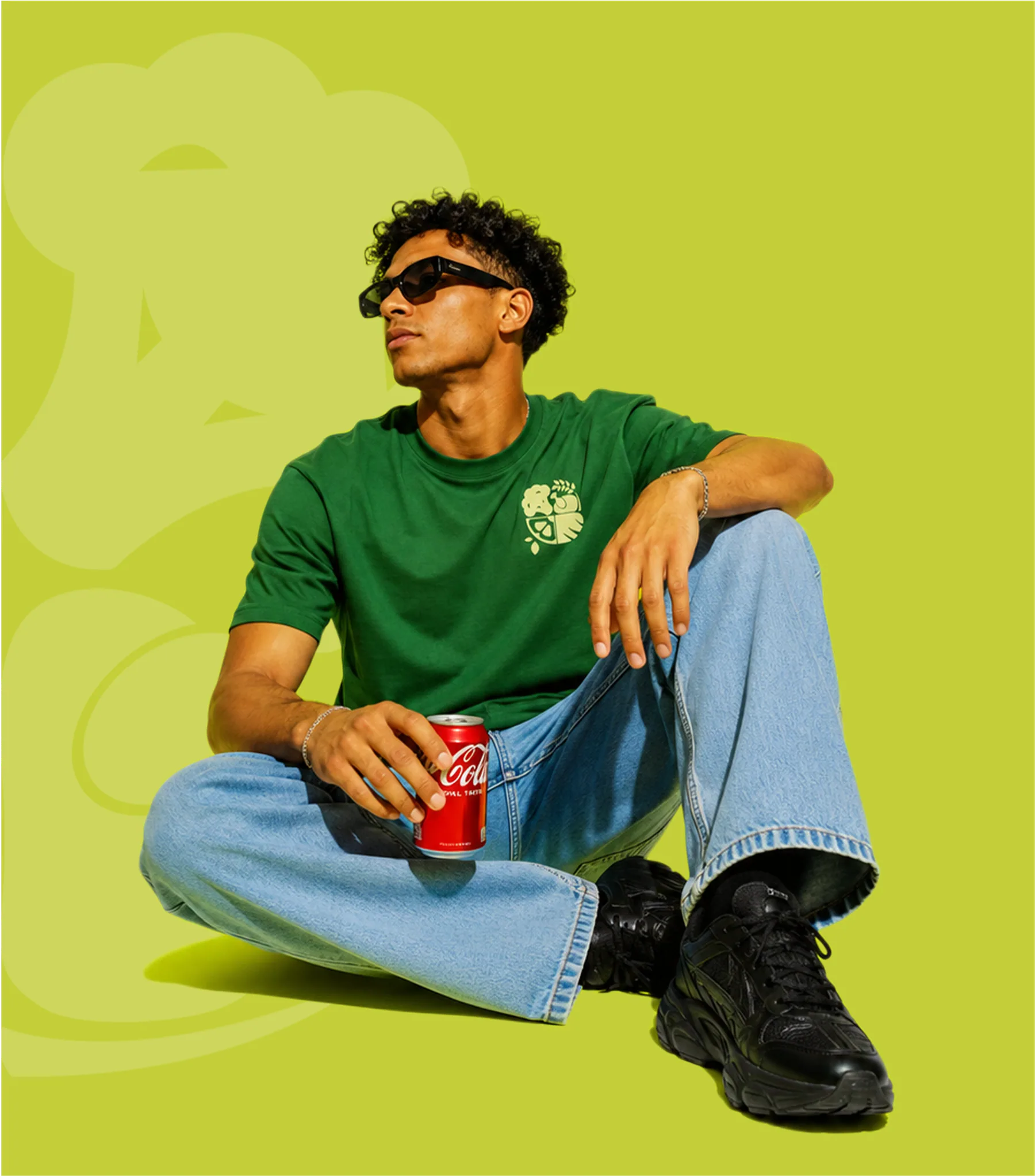
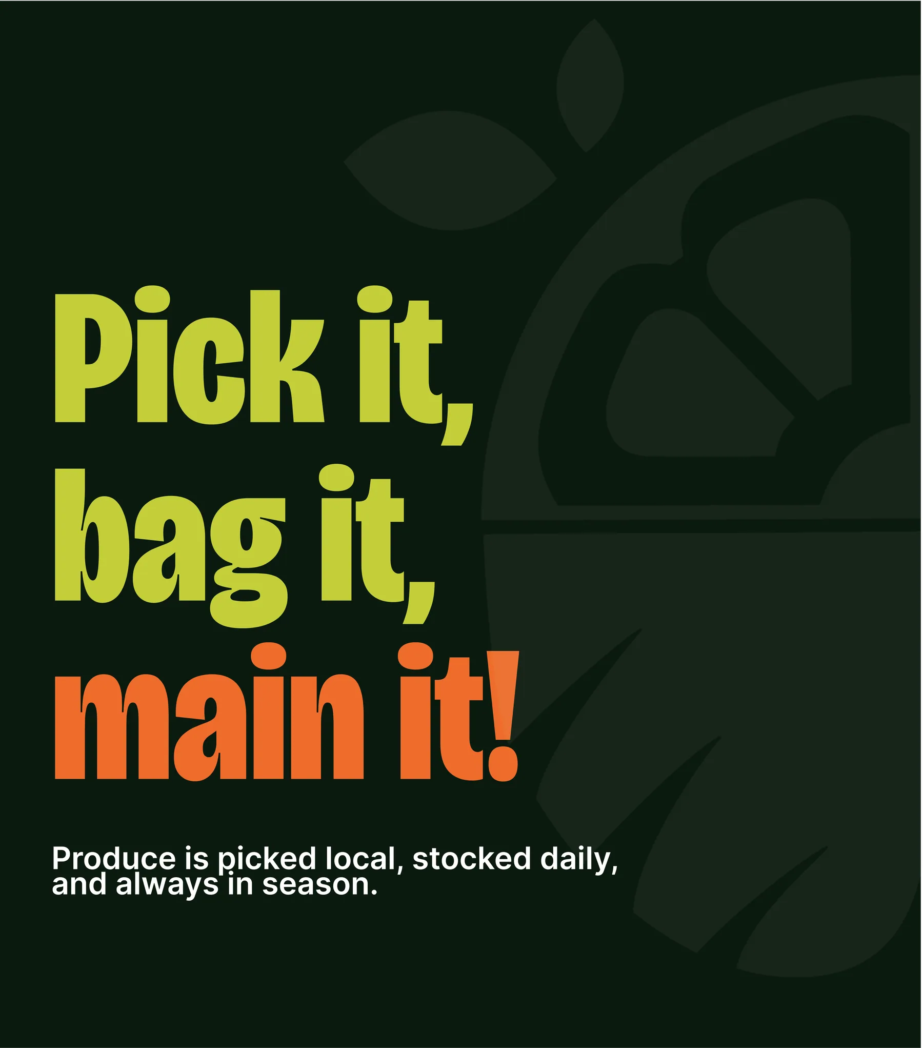
The palette is picked straight from the crates: chartreuse, deep field green and a ripe orange pop. Type gets loud and cheeky where the deals are ("Pick! Bag! Go — 100% local? Oui."), while a custom icon set keeps everything legible from the shelf to the phone. Illustration and photography that make everyday groceries feel warm, human and a little bit fun; never precious, never corporate.
Application
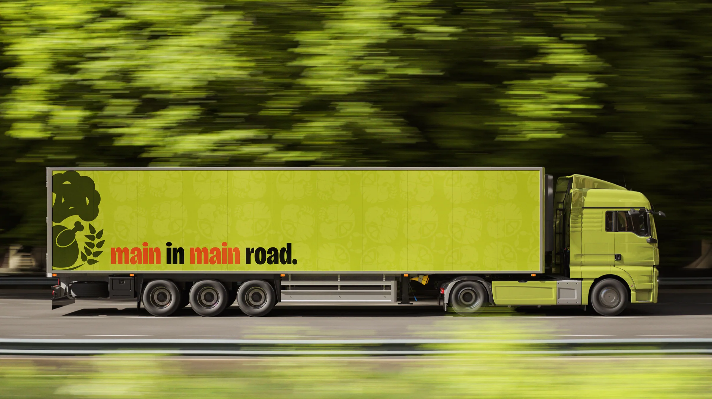
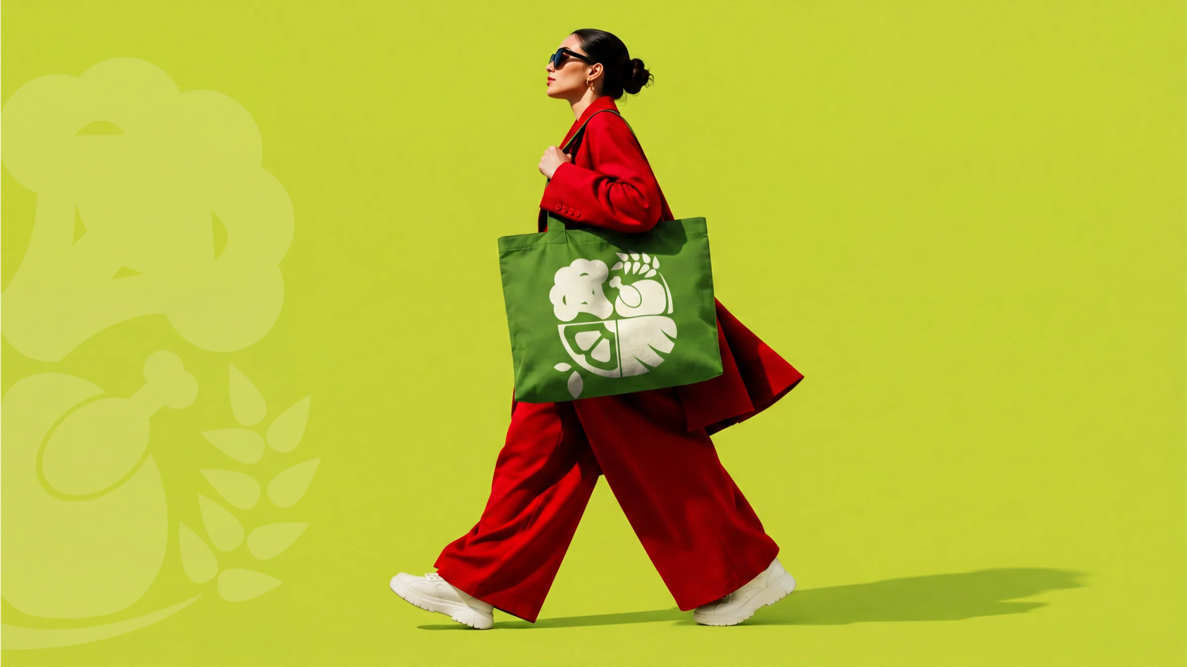
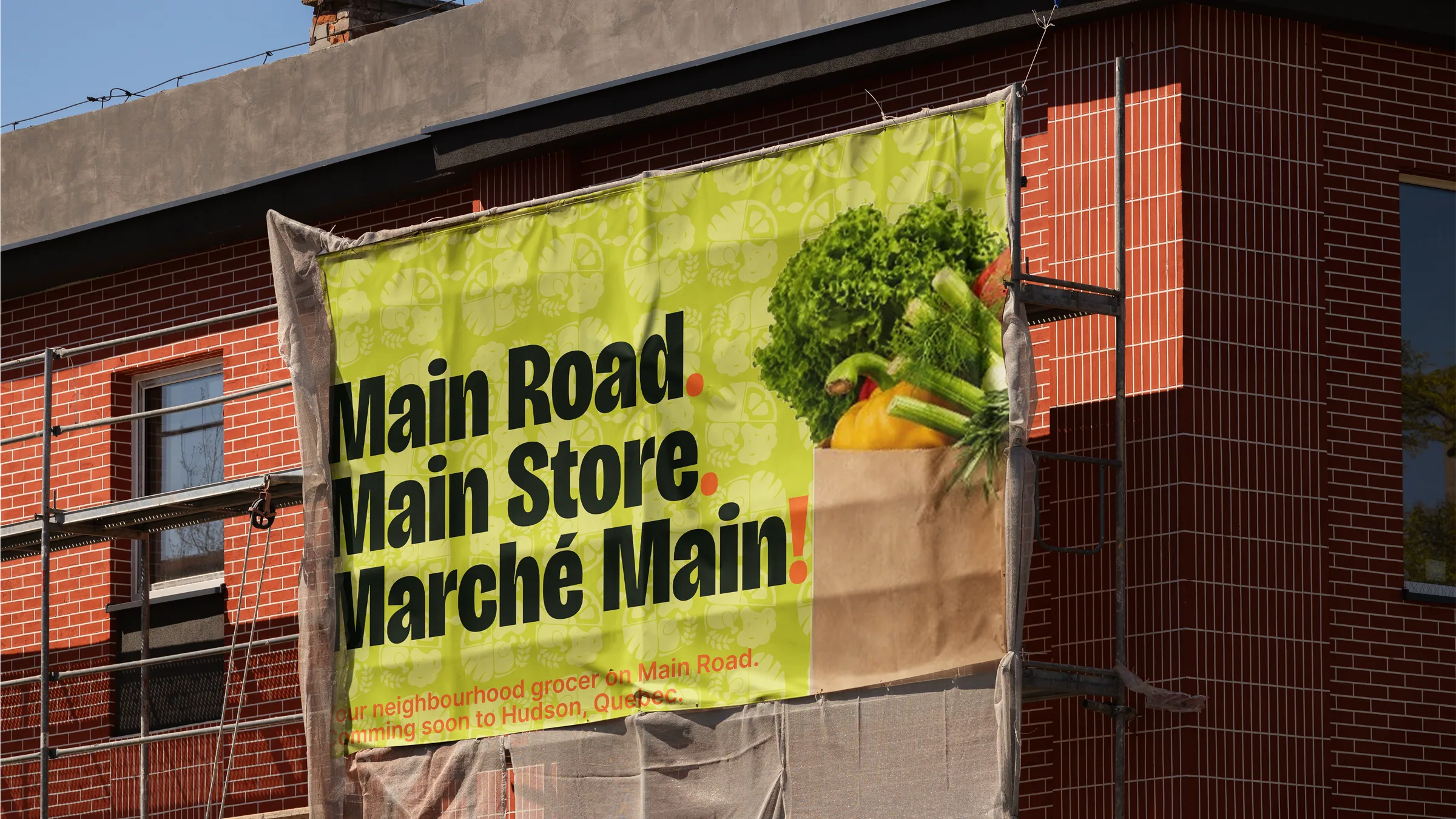
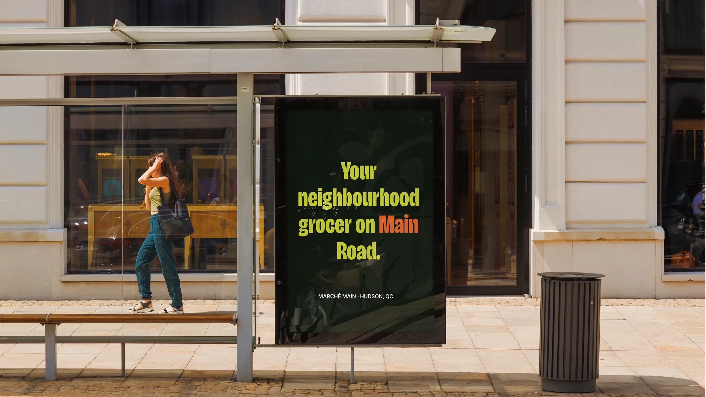
The brand lives where the neighbourhood does. It's the storefront you spot from down the street, the billboard that owns the drive in Main Road. Main Store. Marché Main. The price tags, the bags people carry home like a badge, the shelf-edge signage, and an Instagram feed that sounds like a neighbour, not a chain. Every touchpoint says the same thing in the same voice: fresh, local, main.
Outcome
Marché Main turned a neighbourhood grocery run into something with a name, a voice, and a sense of humour. The brand claims its street instead of blending into it, proof that local doesn't have to mean quiet, and that the smallest shop on Main can still own the whole road.
Related Projects
No related projects yet.